The Pixelated Historian
How’d She Do That? Workflow for the South Street Hospital Website by Stacey Devlin
Creating the South Street Hospital website was the most technically challenging and time-consuming project I was involved during the Fall semester. However, it is also one of the projects that I learned the most from, as I struggled to get the site to look and behave how I wanted. This workflow explains how I created my website based on interactive maps of historical primary sources.
Tools used
Skills acquired through this project:
- ArcGIS:
- Georeferencing raster data
- Creating and editing shapefiles
- Projecting vector data
- Styling shapefiles using CartoCSS
- Assembling interactive maps using Javascript (Mapbox.js, Leaflet)
- Basic HTML and CSS page construction
- Troubleshooting problems using the Template Editor
- TileMill:
- MapBox:
- Blogger:
Workflow

Step 1: Initial Research
As with any other history project, I started with research. Knowing salient events in the hospital’s long history helped me to break it down into meaningful and manageable time ranges for the website. I created a folder on my computer to hold everything pertaining to this project, and I saved my research notes there.
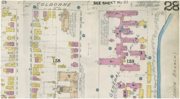
Once I had time ranges in mind, I gathered material to use for my maps. For ArcGIS, I acquired whatever showed the building footprints: so Fire Insurance Plans, city planning maps, and aerial photos. I also compiled other material such as sketches and photographs, which I later used in MapBox.
Step 2: Creating Maps in ArcGIS
I scanned all of my cartographic and graphic material and saved the scans in the designated folder. The maps and aerial photos were imported into ArcGIS and georeferenced over a basemap of modern city data. Use the Georeferencing toolbar (accessible by right-clicking in the toolbar area) to georeference your historical sources by adding control points that link your historical source to the modern map.
In my project folder, I created a new shapefile for each georeferenced historical raster (“raster” referring to picture data, like the maps and photos, and “vector” referring to computer-generated data). This can be done in the Catalog by right clicking on your folder and going to New > Shapefile.
I set the new shapefiles as polygons and chose WGS UTM Zone 17N as a coordinate system. It was necessary to specify a coordinate system so that my work could later be transferred to TileMill. Because I learned this halfway through the project, I projected my already-made polygons using Tools > Data Management > Projections and Transformations > Feature > Project. I told this tool that my input file was NAD 1983 UTM Zone 17N and needed to be changed to WGS; really, it didn’t start out with any coordinate system at all, but the projection tool still worked.
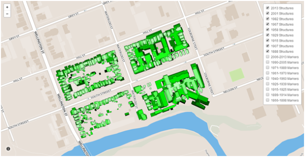
In my new shapefiles, I created polygons by tracing the building footprints in my historical layers.
Step 3: Styling in TileMill
I downloaded TileMill for free and started a new project. Under Layers > Add Layer, I imported each of the vector files I created in ArcGIS (specifically the .shp files). When doing so, I clicked “Save and Style” so that this layer would appear in the CartoCSS sidebar.

Using the HTML Colour Picker on the W3 Schools website, I changed the polygon fill of each layer to a different shade of green. This allows viewers to distinguish between different layers. I “commented out” the default map background (by placing /* and */ around the line specifying the background colour) so that empty areas in my shapefiles would show as transparent.
Step 4: Creating markers for MapBox
Once I liked the look of my map layers, I exported them into MBTiles. I exported each layer individually by making all other layers invisible for each export. I had to go to Export > View Exports > Save to ensure I had copies of the new files.
I created a free account with MapBox.com. Under Add Data, I uploaded my newly-created MBTiles.
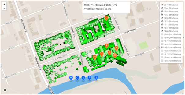
I then went back to my initial research notes. I condensed my findings into point-form lists for each period which could be turned into markers on the map. The process was new and little painful, as I had to be extremely concise and selective about the story I was telling, but I believe I make my methods and intentions clear on the website. For this project I tried to include only markers which point out something that influenced hospital construction.
Creating the points themselves was just a matter of starting a new project and pointing-and-clicking. I used the W3 Schools HTML Colour Picker once again to decide on custom colours for the markers. I added letter symbols to each marker showing the user how to navigate the maps. Some simple HTML tags, including <img> and <a>, were typed in the description box to add images and hyperlinks. The target=”_blank” option was added within the <a> tags so that new links would open in a new tab on the viewer’s browser. An example of my HTML is shown below (from marker “A” in the 1899-1914 map):
<img width=”280px” src=”http://4.bp.blogspot.com/-aD2Mxt5O11g/UqJntcqVFTI/AAAAAAAAABU/f1rwllBUHqw/s160
/1899+-+Victoria+Hospital+and+London+General+Hospital+-+LHSC+Archives.jpg”>London General Hospital undergoes a massive
renovation. Renamed Victoria Hospital, it opens in November 1899. <a href=”http://www.ourroots.ca/e/page.aspx?id=909881″
target=”_blank”> See original image.</a>

Step5: Creating the Website – Structure
WordPress.com is my personal favourite for making websites. However, in this case, I needed to use Blogger because it is one of the only free platforms that allows for custom HTML and JavaScript.
Setting up the website made me think specifically about how I wanted viewers to navigate through it, how loosely or strictly I wanted to tell this story, how much information I wanted to include and where to include it. (Daniel Cohen and Roy Rosenzweig’s book Digital History speaks to this process quite a bit, and provides a good starting point for historians who haven’t done this sort of thing before.) I was especially concerned with making my project easy to understand, which is why I put my maps at the center of my presentation and didn’t surround them with too much text. Although this website isn’t meant to read like an academic essay, I did decide to include footnotes and a bibliography. I personally think the citations make my research more apparent and easier to understand, since there are so many ways to approach the history of this hospital.
Step 6: Creating the Website – Style
After deciding on a basic structure, I set about creating the different pages. I ended up using the HTML editor rather than the word-processor-like (or WYSIWYG) editor, since this gave me better control over the display. I used basic HTML and CSS to do things like create subheadings, divisions within pages, customize my website’s template (for example, I removed the usual Blogger navbar), and create hanging indents in the bibliography.
Writing my own HTML was also necessary to display the maps. Below is the HTML for the2006-2013 HGIS page:
<html> <head> <script src=”//api.tiles.mapbox.com/mapbox.js/v1.5.0/mapbox.js”></script> <link href=”//api.tiles.mapbox.com/mapbox.js/v1.5.0/mapbox.css” rel=”stylesheet”></link> <style>
body { margin:0; padding:0; }
#map { position: relative; top: 0; bottom: 0; width: 100%; height: 600px;}
</style> </head> <body> <h2 style=”text-align: center;”>
Historical Map Source: City of London 2013 Map
<a href=”http://www.southstreethospitalhgis.blogspot.ca/p/1990-2005.html”></br>Previous</a>~~~~~<a href=”http://www.southstreethospitalhgis.blogspot.ca/p/conclusion.html”>Next</a> </h2>
<div id=”map”>
</div>
<script>
var map = L.mapbox.map(‘map’, ‘sdevlin.geo8p1dl’).setView([42.9760, -81.2375], 17);
L.control.layers({
}, {
‘2013 Structures’: L.mapbox.tileLayer(‘sdevlin.rt0diqra’).addTo(map),
‘2006-2013 Markers’: L.mapbox.markerLayer(‘https://a.tiles.mapbox.com/v3/sdevlin.gg0nna6c/markers.geojson’).addTo(map)
}).addTo(map);
</script></body></html>
Much of this was adapted from the MapBox.js example on toggling layers (I wasn’t familiar with JavaScript before last week), but there are some important differences. The “sdevlin…” bit after “map” in the header section specifies my basemap. The “setView” parameters are the latitude and longitude that I want my map to be centered on, and “17″ refers to the zoom level which can range from 1 to 22. Specifying “position: relative” allows me to place text above and below my map. That particular tip was pointed out to me by my good friend at the University of Waterloo, Dominic Aquilina.
At this point, each separate layer is saved as a different map in MapBox. MapBox is free for up to 3,000 views per month. In the creation of the website alone, MapBox has recorded over 300 views. In the future I would like to see if there is a more efficient way of calling marker layers into my maps, so it will be less likely for the cap to be reached.
Troubleshooting challenges
As I worked on the website, various issues came up – for example, Blogger placed white borders around all of the map tiles, thinking they were separate images. In cases like this, I learned how to go into the HTML for the template and look for the code that could be causing problems. Because I had to use HTML so often for this project, I was familiar enough with it to successfully spot the problematic lines of code and remove them. There were some things I never did learn how to do, however. I would like the website to automatically resize to the browser window, and have a custom mobile version of my site. I do plan on maintaining this project well into the future, so as I continue learning I hope to add these features. I am always happy to hear comments on how this website can be improved!
Final remarks
It was a new experience for me to try and convey a historical narrative through means other than an essay or a conference presentation. However, I believe the maps offer a visually compelling and easily accessible way for people to learn about the South Street Hospital.
Putting this website together was a constant cycle of having a vision, starting to execute it, running into a problem, looking for ways to solve the problem, and learning a new skill in order to solve it. I consulted YouTube, the MapBox help forum, and Stack Overflow very often! But although this was a technically-involved project, it was not impossible, and it cost nothing. (The only thing that could get expensive for other projects is ArcGIS; thankfully at Western, grad students are able to have a license to use it. However, there are open-source GIS software packages available.)
This new website represents a significant achievement for me. I pushed myself in a lot of new ways to make this happen. I am especially pleased with the results given the fact that I had never used any of the above tools before October. If I can do it, so can you!
If you’re interested in reading more of Stacey’s blogs you can do so on her personal blog site at http://staceyrdevlin.wordpress.com/.
This entry was posted in Uncategorized and tagged ArcGIS, digital history, fire insurance plan, GIS, GIS map, hgsa, history, history department, how-to, London, London Ontario, map, Ontario, South Street Hospital, Stacey Devlin, The Pixelated Historian, University of Western Ontario, uwo, western university, workflow.