Latest Event Updates
Public History Profiles: Jessica Knapp, Pt. 1
Each year Western University’s Public History MA program attracts dozens of applicants eager to engage with Canadian history outside the Ivory Tower. Only a select few are admitted (fourteen students for the 2014-15 academic year). Jessica Knapp received her Public History MA earlier this year and has already made great progress applying her classroom and practical teachings with the Canadian National History Society (CNHS), the publishers of Canada’s History. For your benefit and entertainment, she has offered to share her experiences with us. This is the first of a two-part profile that gives personal insight on how to – and how not to – land your dream public history job.

How did I get a job right out of graduate school?
Some might say it is a miracle, others might attribute it to it being in the right place at the right time, but I would say it took the right skills, passion, and an open mind to land my current position at Canada’s National History Society (CNHS).
I enrolled in the Public History program at Western University after completing my Bachelor’s degree in History and English at the University of Windsor, because I thought it would help me understand the different career paths that were available to me. Besides the fact that I was a passionate history student who was skilled in conducting research and desired to share my findings, I didn’t know what I could do. It was only with this Public History program that I developed the skills to work as an archivist, a curator, a director, a consultation, heritage planner, and the list goes on.
I was able to assess the job market from a safe-ish distance and develop the skills necessary to succeed once out of graduate school. This program goes a step further than just preparing you for a job, they give you an opportunity to experience the job. The third semester of the program, a.k.a the internship, is where everything came together for me.
I had developed a few different contacts with which I was interested in interning for, but it came down to a passion I carried with me from before the program: historical publishing. Prior to the program I would have assumed that my only career paths would be with a university press, and I almost interned at one, but by talking to the internship coordinator, Mike Dove and previous graduates, I was directed to Canada’s National History Society.
It was a risk, the Society’s headquarters are based in Winnipeg, and I had only ever lived in southern Ontario. After more research about CNHS, I discovered they are one of Canada’s largest public history charities, publish two magazines multiple times a each for two different audiences, and deliver numerous awards to Canadians furthering their communities’ and classrooms’ interest in history. This is when I was convinced I wanted to intern with them. I wasn’t learning a single skill or working with a single person, I would develop a variety of skills and work as part of a team.
I made it so I had an opportunity to work with and get to know everyone in the office, I worked hard, and kept asking for more to do. When I was concerned that there was more I could gain from my internship I asked my supervisor if it could happen, and the answer was always yes.
It was about halfway through my internship that I decided I would like to work for CNHS for a longer period of time. I made my intentions clear to my supervisor and we discussed the possibility. My work ethic had been proven, my ability to work as part of a team, as well as on my own, my ability to think creatively and implement those ideas was also expressed. It is all those basic requirements of a job, as well as my passion for history that let CNHS consider hiring me.
Let it be known that it wasn’t a clean slam dunk, I stressed and struggled with the idea that I might not be offered a position, so I continued to apply for jobs in the heritage section that I was trained and qualified to work at from my experiences in the public history program.
The trick with finding a job in the heritage sector, is finding the organization that has the money. We might not be in this profession for the money, but we live in a world where money has become a necessity. An unpaid internship is a risk you DO NOT have to take.
CNHS saw the value in my work and my dedication that had developed in the short four months I had been there, and they were able to find the money within the organization to justify hiring me.
In a sentence: I was given a task, I completed it and continued to ask for more responsibility until I was a person that other employees needed something from, until I became a resource for them.
Interactive Exhibit Design Part 4 – Playing Games
This is the last of four blog posts dedicated to last winter’s Interactive Exhibit Design course. This set of projects incorporated games and elements of play to encourage visitors to engage with past events.
Laura Walter designed a board game that took players through the entire course of human history. To add an extra layer of interaction, Laura used the Layar app to present players with audio and visual questions that determined whether or not they would advance on the board.
Gianluca Mazzanti and Riley Nowokowski built an exhibit that would give children an opportunity to learn about the social impact of car culture by driving a remote control car over a switch. The switch was connected to a computer through a Makey Makey and would play vintage car commercials when activated.
Joe Fonseca used RPG Maker VX Ace to build his own computer game to take players through various eras of East Asian history. By playing the main character, you can travel back in time to discover important facts about the past while eluding ghosts that will send you back to the present.
Interactive Exhibit Design Part 3 – Touching Artifacts
This blog post is the third in a series featuring the final projects of the Interactive Exhibit Design course that were presented at the conclusion of the Winter 2014 semester. These three projects tackled the most pressing challenge of creating museum exhibits: turning the ephemeral the or abstract into a tangible experience.
Jessica Knapp installed an Arduino board and a Wave shield into a anatomical model of a human skull to bring Shakespeare to life. A visitor can hold the skull in the style of Hamlet and listen to it recite lines of dialogue. By writing some code in C++, Jessica wrote a program that played three different lines of Shakespeare in response to three different combinations of button-pressing.
Stephanie Johns designed an exhibit detailing the history of nail polish. By connecting a cardboard outline of a hand to a computer terminal with a MaKey MaKey, Stephanie built an exhibit that allowed visitors to cycle through videos about the history of nail polish by pressing one of the contact points at the end of each digit.
To illustrate the elaborate layers of women’s clothing in the era of the American Civil War, Elizabeth Miron installed LED lights into the clothing of a doll. The LEDs were controlled through a Phidgets and a program written in Max 6 so that at each push of a button, an LED would light up to indicate the corresponding layer of clothing on the doll and a description of that layer would appear on a nearby computer terminal.
Interactive Exhibit Design Part 2 – Music and the Museum
This is the second blog post in a series that features projects complete as part of last Winter’s Interactive Exhibit Design course. These three projects allowed visitors to interact with an exhibit through movement and music.
Gabrielle Bossy designed the World’s Smallest Rock and Roll Museum as her interactive exhibit, which included a home-made gramophone, constructed from a sewing needle and a cone of construction paper. The museum featured a collection of album covers that could be scanned with the Layar App on a smartphone. Once scanned, the app activated a video that provided additional information about the album and then played the music video for one of the songs featured on that album.
Ryan Hunt used a Kinect video game controller to let visitors play music by moving different parts of their body. The Kinect sensor is made compatible with a Max 6 interface through a tool called Synapse. Once the user’s movements could be read by Max 6, Ryan used Ableton to turn the body’s movements into music.
Oliver Jones attached an accelerometer to a conductor’s baton. Using the accelerometer as an input device, Oliver used Max 6 to build a patch that read the vertical motion of the baton. By waving the baton, a user could set the tempo for a piece of music.
Interactive Exhibit Design Part 1 – Mapping
HTST 9832 offers graduate students the opportunity to design and build interactive exhibits to experiment with different ways of presenting historical research. In particular, the course introduces historians to interaction design, physical computing, and fabrication through hands-on learning that culminates in the creation of a final project.
The first set of projects to be featured on this blog feature mapping to allow visitors to interact with museum exhibits.
Stacey Devlin’s project used Phidgets and Max6 to create an interactive map of 16th Century Portuguese trade networks. Stacey connected a joystick to a computer to allow users to navigate between trading ports. The journey is traced on a map while information about each port is displayed on a computer screen.
Amina Musa used a MaKey MaKey to connect a map of East Africa to a computer monitor. Pushing a button on the map activates a video that display images and information about the corresponding region.
Michael O’Hagan used a similar approach to connect his model of the Second World War Prisoner of War camp in Running Mountain National Part to a computer. The physical model is matched by a virtual model built in Google Sketchup. Pressing buttons on the model brings the virtual model onto the computer screen and displays archival photographs of the corresponding location.
Idi Amin and the Expulsion Decree of 1972 by Shezan Muhamedi
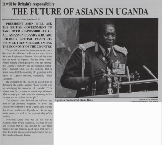
On 4 August 1972, Major General and President Idi Amin delivered a speech to officers and men of the Airborne Regiment while in Tororo, in Eastern Uganda. The president declared that there was no room in Uganda “for the over 80,000 Asians holding British passports who are sabotaging Uganda’s economy and encouraging corruption” (Uganda Argus, August 5th, 1972). Amin told his soldiers that he “wants to see that the economy of Uganda is in the hands of Uganda citizens, especially ‘black Ugandans'” (Uganda Argus, August 5th, 1972). This speech marked the beginning of the Asian exodus. Ugandan Asians had 90 days to leave the country or face drastic consequences. It ultimately marks the beginning of the resettlement of Ugandan Asians and the dramatic scramble of not only my family but thousands of others who were forced to leave Uganda. However, not everyone believed the expulsion decree was going to last. Some Asians in Uganda believed the decree would be recanted and that they would be able to stay. There were a number of motives behind Amin’s expulsion decree beyond that of economic sabotage. Here are just a few:
- Amin criticized South Asians for their failure to integrate with black Ugandans which by and large was a fair assessment. There were seldom instances of intermarriage and collaboration between Ugandan Asians and black Ugandans. This issue, however, must be considered in context of the colonial hierarchy created by British imperialists in Uganda which placed white British colonials at the top, brown South Asians in the middle, and black Ugandans at the bottom).
- Amin also wanted to ‘Ugandanize’ the economy by returning control of the commercial sector to black Ugandans who he viewed as true Ugandan citizens.
- Another reason presented by Amin was that God had advised him to expel the Asians from Uganda which was revealed to him in the from of a dream.
What is particularly interesting within the initial expulsion decree made by President Amin is that he requests that his soldiers “assist him in defending the public against ‘those people who are sabotaging the economy of Uganda. The troops must be prepared to arrest any saboteurs who are trying to undermine the economy of the country and to confuse the people” (Uganda Argus, August 5th, 1972). It is clear that the threat towards South Asians living in Uganda was very real. Even before this warrant to arrest South Asians in Uganda, Colin Legum, the Commonwealth Correspondent for The Observer, a British newspaper based in London, argues that “Amin’s soldiers are making conditions increasingly intolerable for Asian businessmen and their families. Many are forced to pay regular sums to officers and soldiers for protection; girls have been raped; men and women have been arrested; and a number of prominent leaders of the Asian community have simply disappeared without trace” (The Observer, August 6th, 1972. Emphasis added). Even Mr. Kibedi, Uganda’s Foreign Minister was quoted saying, “If they still remain [after the 90 day period in which they will be forced leave] they will soon see what happens to them” (Telegraph, August 7th, 1972. Emphasis added). The threat of physical danger was real and 80,000 Ugandan Asians were faced with an ultimatum to leave the country in 90 days or else face the repercussions of remaining with the country.
The actual number of 80,000 Ugandan Asians has been largely contested. Most newspaper articles and academic works draw an estimate of closer to 50,000. Ultimately, there were some Asians that remained in the country after the expulsion period upon the request of the President. Amin would come to realize that his expulsion decree wreaked havoc on Uganda’s already fragile economy.
You can read more about Shezan’s research on the experience of Ugandan Asians on his blog.
Mapping the Canadian Forestry Corps in Keppernach (Scotland) by Michael O’Hagan
One of my more recent interests is the work of the Canadian Forestry Corps (CFC) during the First World War. The CFC was raised specifically to supply the Allied armies with a desperately-needed resource: timber. Whether it was to needed to support dugouts, hold barbed-wire, or aircraft frames, wood became one of the most basic resources of the First World War. Composed primarily of lumberjacks and foresters, the CFC eventually operated in France, England, and Scotland and succeeded in preventing a timber shortage. For a bit more of a background, you can read another of my posts here.

The CFC was organized into numbered companies of about 100-200 men and were assigned specific forests or woodlands to cut. One of these companies, the 107th (originally No. 7), received a timber limit in Keppernach, Scotland (South of Nairn in the Scottish Highlands). The area in which the company found itself in, the Forest of Cawdor, was no comparison to the Canadian “wilderness” they had left behind. Between 1825 and 1854, over fourteen million trees had been planted here, in an area covering just over 4,000 acres. The majority of the area was populated with Scotch Fir, the most-desired wood for wartime use.

The company’s advance party of fifteen men arrived in late July 1916 and within ten days, had a Scotch mill up and running. A Canadian mill was built in August and the mills ran almost continuously until the camp closed in August 1917. By September 1917, the company had cut 6.5 million F.B.M.
As I’m interested in the relationship between forests and war as well as forest regeneration, I decided to see what I could learn using GIS. Fortunately, the online war diary of the 107th Company includes a relatively uncommon map of the company’s operation at Keppernach.
Even more fortunate, when you search Keppernach in Google Maps, the first (and only) result is Keppernach Farm and takes you to the exact location the 107th Company worked in (see below). This saved me quite some time as I would have otherwise had to search all over Nairnshire for roads that matched up with my map.
In trying to locate some contemporary maps of the site, I discovered that Scotland, and Great Britain for that matter, has some great HGIS sources available online, notably A Vision of Britain Through Time and Old Maps Online.While some of these require you to live in Britain (A Vision of Britain) or charge for digital copies, I was able to get some high quality and detailed maps. Here’s an example from the National Library of Scotland. These maps were produced by the Ordnance Survey and published in 1905 so they provide the perfect backdrop to CFC operations in the following decade.

I then threw everything I had into Quantum GIS (QGIS) and georeferenced the maps.

While the hand-drawn CFC map doesn’t line up perfectly with the other layers, it still provides a sufficient sense of what the operation looked like. I was somewhat surprised to find that from the air, it is impossible (for me at least) to tell that this forest had been completed cleared in 1917 and that the roads, pathways, and borders remain virtually unchanged. I also found it interesting in that the forested area had actually expanded (likely the result of interwar afforestation efforts brought about by the wartime shortage of timber) and that you can still make out the site of the Canadian camp (large rectangle on the left).
Now with a base to work from, I added the information found in the war diaries and the historic map to produce the following:

For the moment, this is a chance for me to refresh my GIS skills (which I apparently lost while home for the holidays) and a quick experiment to see what I can extract from the archival records. While it is very much a microhistory, I’m hoping that it will lead to some new information and insight into the role of the Canadian Forestry Corps.
For more information about the Canadian Forestry Corps and my research, please visit my blog.
The Utility of an Online Bibliography by Joel Sherlock
I just completed a blog/website about the White Rose, a German Nazi-Resistance group that existed from 1942 to 1943 led by Hans and Sophie Scholl. They began a leaflet campaign denouncing the Nazis and the Holocaust, and calling upon Germans to rise up and fight against Hitler. Hans and Sophie were caught distributing leaflets at the University of Munich on February 18, 1943

and were executed four days later along with the co-conspirator Christoph Probst. The other three members of their group were executed shortly thereafter. After the war, their memory was carried on by their father, and other friends and members of the White Rose distribution network that survived the war.
While I was researching this topic, I noticed two things: first, there were a lot of websites dedicated to the White Rose that were far better than what I could possibly create; and second (and more importantly), there lacked a solid bibliography of White Rose resources in English. Knowing that the Scholl’s Gestapo interrogation interviews had been translated into English, I looked for them at the Western University library but to no avail. I emailed the History librarian suggesting that the library purchase that item. She responded back to me very quickly saying that she had struggled to find White Rose primary sources and would purchase them right away. I thought that was interesting since I had had a similar experience in my senior year of my undergrad at BYU with the History librarian.
My next question was, “How do two librarians at highly reputable universities not know about these very important resources?” My first thought was that maybe the publishing company didn’t market their materials very well. Second, it’s likely that they don’t have agreement with the two major academic book distributors–YBP and Coutts–to market their materials.
In these days where librarians don’t have time to seek out new materials, they are at the mercy of collection development tools that marketers create for them like selection software, search engines and recommendations (see “Customers Who Bought This Item Also Bought”) that websites like Amazon and Barnes and Noble create, and flyers and catalogues. Though these are solid tools, they do not represent a comprehensive inventory of what is available on a given topic. As a result, students and researchers are affected because their library has bought, to a degree, an imbalanced and biased collection. What do we do to resolve this issue? How can librarians make available a balanced collection without straining their other responsibilities?
My proposal is to bring back the bibliography. Before the internet age librarians would purchase bibliographies for their libraries so that researchers would know what was available for their research topic. The bibliography has since been replaced by library open public Access catalogues (OPACs), Google searches (including Books and Scholar), and the other tools I mentioned above. I would propose that rather than publishing these items in print again, these bibliographies be made available online through blogging sites like Word Press or Blogger, or using Wiki tech software. This way they can be easily added to, and users can contribute resources that they have found that the bibliography’s creator might have missed. I am also proposing that amateurs get involved with this kind of work. If you think you are somewhat of an expert on a topic, I would suggest you start compiling a list of sources relevant to your favourite research topic and make them available online for both librarians and researchers to use.
So this is what I have created. I know it’s not particularly graphically appealing, but the information is there, and I think it’s alright. If you go to the Bibliography and Webography sections, you’ll find lists of resources on The White Rose, both primary and secondary. I’m particularly pleased with the quantity of resources that I have. I do realize though it is still a work in progress, and the next step will be to annotate the Bibliography and Webography to make them more useful and informative to researchers.
I am tired of the commercialization of library collection development. I am tired of publishers and distributors telling librarians what to buy and shielding librarians from what they actually need. I am tired of library administrators pressuring librarians to adapt to their “system” and abandon the old ways of collection development. Let’s allow librarians to take collection development back, and give them a say in what they will acquire, and ensure that the library collection will rise to be the best and balanced research collection available.
If you would like to read more of Joel Sherlock’s work, visit his personal blog here!
Leaving New Frontiers 2014 by Jessica Knapp
Over the past weekend (Feb. 20th-22nd 2014) I attended and presented at York’s 2014 New Frontiers Conference and it was truly a new frontier for me. I have presented at two conference previous, but the experience at York was incomparable. From the moment I registered I was greeted by the organizing committee and engaged in a discussion about public history. The best part of attending a conference is feeling like you belong; you are with people who share your passion for history and sharing that history with others. Besides early Saturday morning, I was sporting a smile from ear to ear simply because the experience is euphoric.
I was fortunate to be able to present early in the conference on a topic that I became considerable involved with in my fourth year of studies at the University of Windsor while earning my B.A. in History and English, Windsor’s local history. Working with Guillaume Teasdale, I was able to produce a significant contribution to the scholarship of black history in Windsor. Both the University of Windsor and the Essex County Historical Society thought so as well and I was awarded the David P. Botsford Memorial Scholarship for my paper entitled “‘On the importance of education…it is as necessary as the light–it should be as common as water, and as free as air’: Perpetuating Racial Discrimination through Education in Nineteenth Century Windsor and Sandwich.”
The first night of New Frontiers opened up to a round table discussion about Public History and the First World War. Concerning the upcoming centenary of The Great War (click on the link to ask Thomas Littlewood from UNB about the various titles for the First World War), the historians present made it a point to discuss how it has been remembered and commemorated, but also that we need to change what the war is remembered for. It is important to understand that when history is presented, specifically to the public it comes from a particular perspective and bias, usually from institution supporting the presentation financially. As public historians we take the role of displaying and relaying history to the public seriously and with care, but we can only do a better job if the public (that’s you!) gets involved. So please leave a comment about what draws you to museums or more generally history!
The second day of New Frontiers was packed full. A generous selection of panels with innovative and intriguing topics it was more often than not difficult to choose which sessions to attend. After presenting in the morning I was free to be absorbed by the other concepts and theories floating around. Paying particular attention to Public History I attended the panel called”Public Memory and Commemoration.” And to my surprise I was greeted by a current Phd candidate from UWO, Jon Weier, who was moderating the panel. Introductions were obviously in order when Robyn Schwarz-Pimer , a panelist also explained she is UWO alumna. Along with Robyn, both Thomas Littlewood and Jesse Robertson presented succinctly. The panelists and audience members discussed authority, access to sources, and the response to historical events through music. Please reach out to these historians if you would like to know more about what they presented on.


Up next was “Public History and Education” featuring two UWO Public History students Gabrielle Bossy and Joel Sherlock. Joel discussed his work in the library at the Museum of Ontario Archaeology and Gabrielle discussed her digital history project on the Annandale house in Tilsonburg, Ontario. Another panelist, Danuta Sierhuis, shared her experiences and challenges with the Digital Age and the Lost Ottawa Facebook Page.


The Keynote Dinner and Address were outstanding. First of all the food was out of a five star restaurant. Second, Dr. Rhonda Hinther is not only an elegant, well spoken, and passionate public historian, but she is approachable and generous with her time and resources. Dr. Hinther encouraged MA and Phd students to push for public history opportunities. She stressed that ‘Preparedness is essential’ and to never go back to your coffee shop job. Once you have developed the soft skills and have an inclination and experience with history you are able to land a job within the public history realm, or create one for yourself. Dr. Hinther not only gave us the spark we needed to prepare for jobs in public history, but she showed us that we can be in control of our opportunities and be successful.

It was a pleasure to attend, present, and moderate at York’s 2014 New Frontiers Conference, and a pleasure and honour to listen to and meet Dr. Rhonda Hinther.
Thank you to planning committee and to all those that attended. Hope to see you again soon. Maybe when we all have jobs!
Keep watching In the Face of History for a write up on Carleton’s Underhill Colloquium coming up March 6th 7th and 8th where I will be presenting about Archival Forgery.
If you’re interested in reading more of Jessica Knapp’s blogs you can do so by clicking here!
How’d She Do That? Workflow for the South Street Hospital Website by Stacey Devlin
Creating the South Street Hospital website was the most technically challenging and time-consuming project I was involved during the Fall semester. However, it is also one of the projects that I learned the most from, as I struggled to get the site to look and behave how I wanted. This workflow explains how I created my website based on interactive maps of historical primary sources.
Tools used
Skills acquired through this project:
- ArcGIS:
- Georeferencing raster data
- Creating and editing shapefiles
- Projecting vector data
- Styling shapefiles using CartoCSS
- Assembling interactive maps using Javascript (Mapbox.js, Leaflet)
- Basic HTML and CSS page construction
- Troubleshooting problems using the Template Editor
- TileMill:
- MapBox:
- Blogger:
Workflow

Step 1: Initial Research
As with any other history project, I started with research. Knowing salient events in the hospital’s long history helped me to break it down into meaningful and manageable time ranges for the website. I created a folder on my computer to hold everything pertaining to this project, and I saved my research notes there.
Once I had time ranges in mind, I gathered material to use for my maps. For ArcGIS, I acquired whatever showed the building footprints: so Fire Insurance Plans, city planning maps, and aerial photos. I also compiled other material such as sketches and photographs, which I later used in MapBox.
Step 2: Creating Maps in ArcGIS
I scanned all of my cartographic and graphic material and saved the scans in the designated folder. The maps and aerial photos were imported into ArcGIS and georeferenced over a basemap of modern city data. Use the Georeferencing toolbar (accessible by right-clicking in the toolbar area) to georeference your historical sources by adding control points that link your historical source to the modern map.
In my project folder, I created a new shapefile for each georeferenced historical raster (“raster” referring to picture data, like the maps and photos, and “vector” referring to computer-generated data). This can be done in the Catalog by right clicking on your folder and going to New > Shapefile.
I set the new shapefiles as polygons and chose WGS UTM Zone 17N as a coordinate system. It was necessary to specify a coordinate system so that my work could later be transferred to TileMill. Because I learned this halfway through the project, I projected my already-made polygons using Tools > Data Management > Projections and Transformations > Feature > Project. I told this tool that my input file was NAD 1983 UTM Zone 17N and needed to be changed to WGS; really, it didn’t start out with any coordinate system at all, but the projection tool still worked.
In my new shapefiles, I created polygons by tracing the building footprints in my historical layers.
Step 3: Styling in TileMill
I downloaded TileMill for free and started a new project. Under Layers > Add Layer, I imported each of the vector files I created in ArcGIS (specifically the .shp files). When doing so, I clicked “Save and Style” so that this layer would appear in the CartoCSS sidebar.
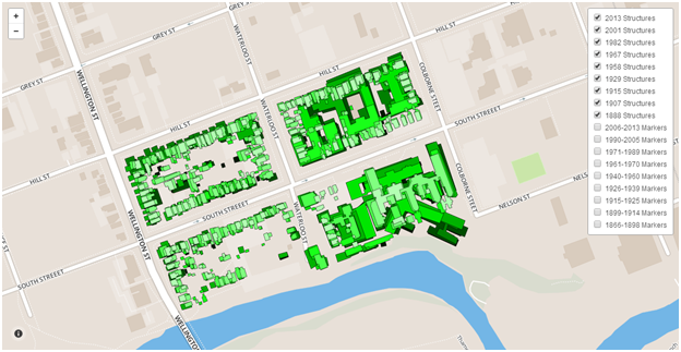
Using the HTML Colour Picker on the W3 Schools website, I changed the polygon fill of each layer to a different shade of green. This allows viewers to distinguish between different layers. I “commented out” the default map background (by placing /* and */ around the line specifying the background colour) so that empty areas in my shapefiles would show as transparent.
Step 4: Creating markers for MapBox
Once I liked the look of my map layers, I exported them into MBTiles. I exported each layer individually by making all other layers invisible for each export. I had to go to Export > View Exports > Save to ensure I had copies of the new files.
I created a free account with MapBox.com. Under Add Data, I uploaded my newly-created MBTiles.
I then went back to my initial research notes. I condensed my findings into point-form lists for each period which could be turned into markers on the map. The process was new and little painful, as I had to be extremely concise and selective about the story I was telling, but I believe I make my methods and intentions clear on the website. For this project I tried to include only markers which point out something that influenced hospital construction.
Creating the points themselves was just a matter of starting a new project and pointing-and-clicking. I used the W3 Schools HTML Colour Picker once again to decide on custom colours for the markers. I added letter symbols to each marker showing the user how to navigate the maps. Some simple HTML tags, including <img> and <a>, were typed in the description box to add images and hyperlinks. The target=”_blank” option was added within the <a> tags so that new links would open in a new tab on the viewer’s browser. An example of my HTML is shown below (from marker “A” in the 1899-1914 map):
<img width=”280px” src=”http://4.bp.blogspot.com/-aD2Mxt5O11g/UqJntcqVFTI/AAAAAAAAABU/f1rwllBUHqw/s160
/1899+-+Victoria+Hospital+and+London+General+Hospital+-+LHSC+Archives.jpg”>London General Hospital undergoes a massive
renovation. Renamed Victoria Hospital, it opens in November 1899. <a href=”http://www.ourroots.ca/e/page.aspx?id=909881″
target=”_blank”> See original image.</a>

Step5: Creating the Website – Structure
WordPress.com is my personal favourite for making websites. However, in this case, I needed to use Blogger because it is one of the only free platforms that allows for custom HTML and JavaScript.
Setting up the website made me think specifically about how I wanted viewers to navigate through it, how loosely or strictly I wanted to tell this story, how much information I wanted to include and where to include it. (Daniel Cohen and Roy Rosenzweig’s book Digital History speaks to this process quite a bit, and provides a good starting point for historians who haven’t done this sort of thing before.) I was especially concerned with making my project easy to understand, which is why I put my maps at the center of my presentation and didn’t surround them with too much text. Although this website isn’t meant to read like an academic essay, I did decide to include footnotes and a bibliography. I personally think the citations make my research more apparent and easier to understand, since there are so many ways to approach the history of this hospital.
Step 6: Creating the Website – Style
After deciding on a basic structure, I set about creating the different pages. I ended up using the HTML editor rather than the word-processor-like (or WYSIWYG) editor, since this gave me better control over the display. I used basic HTML and CSS to do things like create subheadings, divisions within pages, customize my website’s template (for example, I removed the usual Blogger navbar), and create hanging indents in the bibliography.
Writing my own HTML was also necessary to display the maps. Below is the HTML for the2006-2013 HGIS page:
<html> <head> <script src=”//api.tiles.mapbox.com/mapbox.js/v1.5.0/mapbox.js”></script> <link href=”//api.tiles.mapbox.com/mapbox.js/v1.5.0/mapbox.css” rel=”stylesheet”></link> <style>
body { margin:0; padding:0; }
#map { position: relative; top: 0; bottom: 0; width: 100%; height: 600px;}
</style> </head> <body> <h2 style=”text-align: center;”>
Historical Map Source: City of London 2013 Map
<a href=”http://www.southstreethospitalhgis.blogspot.ca/p/1990-2005.html”></br>Previous</a>~~~~~<a href=”http://www.southstreethospitalhgis.blogspot.ca/p/conclusion.html”>Next</a> </h2>
<div id=”map”>
</div>
<script>
var map = L.mapbox.map(‘map’, ‘sdevlin.geo8p1dl’).setView([42.9760, -81.2375], 17);
L.control.layers({
}, {
‘2013 Structures’: L.mapbox.tileLayer(‘sdevlin.rt0diqra’).addTo(map),
‘2006-2013 Markers’: L.mapbox.markerLayer(‘https://a.tiles.mapbox.com/v3/sdevlin.gg0nna6c/markers.geojson’).addTo(map)
}).addTo(map);
</script></body></html>
Much of this was adapted from the MapBox.js example on toggling layers (I wasn’t familiar with JavaScript before last week), but there are some important differences. The “sdevlin…” bit after “map” in the header section specifies my basemap. The “setView” parameters are the latitude and longitude that I want my map to be centered on, and “17″ refers to the zoom level which can range from 1 to 22. Specifying “position: relative” allows me to place text above and below my map. That particular tip was pointed out to me by my good friend at the University of Waterloo, Dominic Aquilina.
At this point, each separate layer is saved as a different map in MapBox. MapBox is free for up to 3,000 views per month. In the creation of the website alone, MapBox has recorded over 300 views. In the future I would like to see if there is a more efficient way of calling marker layers into my maps, so it will be less likely for the cap to be reached.
Troubleshooting challenges
As I worked on the website, various issues came up – for example, Blogger placed white borders around all of the map tiles, thinking they were separate images. In cases like this, I learned how to go into the HTML for the template and look for the code that could be causing problems. Because I had to use HTML so often for this project, I was familiar enough with it to successfully spot the problematic lines of code and remove them. There were some things I never did learn how to do, however. I would like the website to automatically resize to the browser window, and have a custom mobile version of my site. I do plan on maintaining this project well into the future, so as I continue learning I hope to add these features. I am always happy to hear comments on how this website can be improved!
Final remarks
It was a new experience for me to try and convey a historical narrative through means other than an essay or a conference presentation. However, I believe the maps offer a visually compelling and easily accessible way for people to learn about the South Street Hospital.
Putting this website together was a constant cycle of having a vision, starting to execute it, running into a problem, looking for ways to solve the problem, and learning a new skill in order to solve it. I consulted YouTube, the MapBox help forum, and Stack Overflow very often! But although this was a technically-involved project, it was not impossible, and it cost nothing. (The only thing that could get expensive for other projects is ArcGIS; thankfully at Western, grad students are able to have a license to use it. However, there are open-source GIS software packages available.)
This new website represents a significant achievement for me. I pushed myself in a lot of new ways to make this happen. I am especially pleased with the results given the fact that I had never used any of the above tools before October. If I can do it, so can you!
If you’re interested in reading more of Stacey’s blogs you can do so on her personal blog site at http://staceyrdevlin.wordpress.com/.
